AS Media Studies - Evaluation - Question 7
View more presentations from Jessbinx.


 However, on the plus, I was able to benefit from the modern lighting tools within the photography studio, using them to backlight or illuminate my models where appropriate.
 My final target audience would be musical aspirers from the ages of 16-24, ranging demographically from C2-B or possibly A. They would generally be of indie/alternative style, and have musical interest in this same genre. As it is intended also to inspire and assist students hoping to go into the music industry, the age range of 16-24 suits the main ages of students, catching them from 16, where college choices first begin to become important in choosing a job in the future, to uni, where finding a career would now be high on the priority list. Bearing in mind this student age, the price of my magazine is impacted, making it only £2.00 to be affordable to those with a low expendable income.


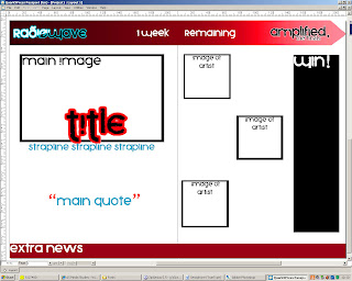
 Having completed my front cover, I posted it up on facebook to gain some final critique and clear up any errors. One point made was the relevance of the bottom photos, which I had intended to be pull out posters, so I went back and labelled them to make it more obvious. I also added
  a small
  barcode which wouldn't obscure anything important on the page, and the price, which I had previously missed, putting it as £2.00 as this was the average price that people had said they would pay in previous comments.

 The comments I recieved for my first drafts were fully positive, and many commented on liking the fonts and layouts, which made the point of my draft a success. My attention in two posts were drawn to places I will need to improve, alter or pay attention to, in one case, noting I will have to
 be careful when putting in my front cover that I do not forget to edit out the smaller white spaces at the bottom of the page, and another comment pointing out there was an accidental variation of colour between the orange of my front cover and contents page, something I will certainly now change, because I want uniformity in my magazine's themes.
 Though many of my photos went uncommented on, the photo for my main article in the double page spread was given attention, particularly
  after I voiced my fears as to whether it appeared too edited (as this was the photo in which I was forced to edit out the whole background because light fixtures, the wall and floor could be seen beyond the small studio set). I recieved mixed comments in return. Whilst some agreed it did look obviously photoshopped, something I had attempted to avoid, others in fact voted the photo the best out of the shoot, and with comments differing so much, I feel I will keep the photo as it is, as any more editing now would probably impact more negatively on it than if I leave it alone.
Main Article Photo - Too edited?


As I wanted to make the colours extra striking, I played with the hue and saturation of the image to make the red stand out, as I want red and black to be a big theme with the double page spread. I'm going to use this picture to accompany information on the artist. I also wanted the models to be almost comically looking across the page at each other, which is why I wanted the model to be looking up.

Another head shot for my artist information on my double page spread. Looking down at the other models across the page.

The most comical of the three headshots, I wanted one of the models to be left out of the staring between the other two artist information photos, and look mock-suprised at being left out, continuing the theme of rivalry that I wanted in the double page spread between the three models.

This is my final image for my double page spread article, the main picture. Before, I had wanted it to be one model feigning attack at the other two, but the small size of the studio prevented this. It also almost prvented me from using this photo because the lighting and wall behind the backdrop could be seen. Luckily I was able to edit this out with relative success. I again played with the hues of the red to make the guitar and models' hair stand out.
 This is the shot for the front cover, all three models looking straight at the camera, and so looking at the reader, targeting them. I foreshortened the models by standing on a stool to take the picture, as I wanted a full body shot, but it is also useful that the bottom of the shot is relatively dark, so I would not be losing out on any detail when covering this part of the photo with my magazine information

I created the draft of my front cover mainly in Photoshop, for its ability to manipulate objects on seperate layers, and also its drawing capabilities, which was really useful in creating aspects like the glow effect of the fonts and also drawing and editing shapes. I'm happy with the layout, but I might need to squash the lower elements down slightly to make the large main front cover photo more dominating. I also might need to get rid of the top information bar if I want the heads of the front cover models to obscure a little of the title.

My contents page was put together in Quark Express, a desktop publisher, though some of the elements were initially created in Photoshop due to Quark's inferior drawing and image manipulation abilities. Again, I am happy with the general layout and colour scheme of the page, but slightly dissatisfied with the abbreviated Radiowave logo, which is poorly clipped with Quark's image transparency settings. I might need more photographs other than the main image, as I have not yet decided how large I want the editor's note to be, so the amount of space I have for contents is sketchy so far.

Again, my double page spread is designed and put together in Quark Express. I'm hoping the layout will remain similar to this, though I might need more room for the information on each artist. I changed the colour scheme for this because the photos mainly follow a black, white, red and blue theme, and the normal orange and blue theme wouldn't have fitted. The article I plan to write for this bit will hopefully be about 3 finalist bands in a competition created by the magazine and information on some of the bands' members. I might also make the bottom news bar gradiented like the top.


 I went out with my camera last weekend to test out a few poses and shots with a friend who had also agreed to be a model for my final magazine. We went through a few poses which might be useful, and after taking them, I also tweaked the colours and lighting on Photoshop to achieve warmer/cooler tones, and look at techniques I may need to consider on my final photos. I like some of the photos enough to possibly include one or two of them as part of my final double page spread, and I plan to use my friend again for the front page.


Accompanying the picture, I also asked:
-Would this appeal to you and why?
-Are the colour/font themes effective? (I'm thinking of using the blue/orange theme, but speculation would help!)
-Where would you expect to find this magazine?
-Aside from articles on the bands themselves, what else would you like to see?
-What price would you expect to pay for it?
The moodboard got a very positive reaction, the fact I incorporated things b eyond a normal music magazine such as records and tapes, as well as fashion was well recieved. By striking this balance, I've managed to encourage a wider audience, as noted by one messager: "It appeals to me cos it has a mix of images, such as skinny jeans for the youth and LPs for the older generation. The font is good cos it isn't too childish but it isn't too formal either :)" Similarly, the colour scheme "works well" but I might have issues overlaying the brighter colours onto equally pale backgrounds, something I will have to pay attention to if I want my text to be legible. Every messager, when asked what else they would like to see, suggested both band interview
 s and, interestingly, fashion, a topic not often covered by music magazines, and a possible niche market for me, as I think that fashion and music are indeed linked, and this could open up possibilities for moneymaking though charging particular clothing stores to advertise in the magazine. Everyone expected to find this magazine at supermarkets, within the music section, but one messeger also suggested "indie clothing shops such as Urban Outfitters or Blue Banana" which would also be pretty useful, both targeting my audience and again exploiting fashion routes. On average, every person averaged on £2 paid on price, less than magazines such as Kerrang, but fitting the target audience, many of which would be teenagers with a lesser allo
 wance/access to money.

 and through this Bauer Media, has produced many popular magazine titles, including Heat, Bella, Q and Kerrang; in being a major company, they have gathered enough of both a reputation and money to be able to successfully fund so many. Vice, a smaller independent publishing company is focused singly on the production of the magazine Vice, though also branches into film, dvds (e.g. "Heavy Metal in Baghdad"), books and art.
 exposed to the largest possible audience on an almost constant basis and are priced based on such a wide audience. The multi-platform market is also exploited by the company, saturating it
 in all forms – radio, tv, magazine and also in live events (e.g. awards) Vice, however, distributes in a seemingly small-scale manner, but in fact does so on a worldwide scale, reaching far across Europe and the US. However, it is free for the reader and seems to get its money from advertising, being stocked in alternative and indie shops such as Urban Outfitters and Retro Bizarre. It also posts much of its contents online to leave itself open to as many people as possible.
 high quality, more generalised magazine. Vice, though independent, also is able to target a large audience, anything from A – C2. It is sold worldwide, but through a more
  individual, niche market which is actually seemingly equally successful.
 ience target also explains the relevance of their titles. Whilst Q subtley references to musical "cueing" of a record in preparation to play, understood only by those who would take music more seriously, NME is simply an abbreviated version of the "New Music Express", shortened to become snappy and more memorable. Kerrang, however, is onomatopoeic, representing the sound of a power-chord, and quite obviously appealing to those
 who are very centred on the audio-responsive whilst not being technical, people who appreciate music through listening and playing rather than necessarily understanding its process. It is interesting that the title in itself is also a screamer, reinforcing the striking title.
 om the style of the photos that Q is the most commercial of the
 magazines - the photos taken, particularly for the cover, are simplistic but seemingly very carefully shot and posed studio pictures, with makeup carefully done and the artists dressed to a theme, not always looking at the camera in their pose, and likely to be Photoshopped. This conforms to the stereotype of a "glossy" magazine and shows psychographically that its audience is much closer to being mainsteamers than the other magazines. Kerrang and NME, however are much more casual, and although many of the pictures are obviously posed in studios, there is a more natural theme and a more individualist nature; the whole band is shown relaxed and looking at the camera, targeting the reader. Also, there are many actual live pictures from gigs and shows, often including the audience themselves, involving them in the magazine.
 of all three follow a systematic template, generally composed of: a column listing the articles (aligned either left or right), split into categories of regular features and specials, all of which having a heading and subheading and a dominating and large photo of a major feature, accompanied by a subheading. Whilst Q simply leaves this as it is, Kerrang and NME have extra features which supplement the template: NME provides an artist index column, helping a fan navigate to their favourite band. Kerrang always leaves a note from the editor, reinforcing an apparent magazine-reader communication and familiarity. The double page spreads, too, follow a ba
 sic template, generally being dominated by a large picture, keeping to a particular colour scheme. Quite often, the magazine still enforces its title by giving each article a top bar including the title of the magazine and the category of the article. Whilst Q is the most textual of the three, seeking to inform and educate the reader, Kerrang is most visual, adding to the largest p
 icture by overlaying smaller ones and creating montages. What is interesting about this is how Kerrang can devote a double page spread to such small textual pieces (such as the article pictured). Q, being quite the opposite of this, seems generally to devote double page spreads to major articles, and photos are not used to the detriment of the article's size, as the purpose of this magazine is to inform to a much greater extent than magazines like Kerrang and NME, and needs not necessarily rely upon photos to add interest to the articles.