Thursday, 28 January 2010

Final Piece: Front Cover

Based on the critique and research I gathered, I put together my final front page on Photoshop, due to its much more efficient image manipulation capabilities. I created the different elements of the cover on many different layers, which meant I could move them around and alter them independantly, and slowly built up both text and my final images from my photoshoot.
From my previous analyses, I found it was effective when the heads of the models blocked part of the title, so attempted to mimic this in my own by erasing parts of the photo then smudging the hair to make it appear intact. I only made the centre model overlap the title, which in turn centres the whole page effectively.


All three models are looking directly at the camera and thus the reader, targeting them, and all models are around the lower to middle age range of my target audience so the reader is able to be engaged and feel included. I also included a few extra photos from the shoot and one photo from my experimental shoot, adding a different colour theme to the page instead of another dark image.
I didn't add too many screamers - I wanted my magazine to be more relaxed and more refined than Kerrang, but when I did, I feel it added more effect.
I kept the colour scheme minimal, keeping the the blue and orange theme which had been well liked in my audience comments, but the dark scheme did mean I had to outline much of the text to make it readable.
Overall, I am very happy with my front cover, and don't think I could have added any more to it than perhaps a barcode.

Tuesday, 26 January 2010

Development: Further Feedback

I again posted my work onto Facebook, where I asked my target audience their opinions on what I had now done, both with my drafts and photos.


First Drafts


The comments I recieved for my first drafts were fully positive, and many commented on liking the fonts and layouts, which made the point of my draft a success. My attention in two posts were drawn to places I will need to improve, alter or pay attention to, in one case, noting I will have to
be careful when putting in my front cover that I do not forget to edit out the smaller white spaces at the bottom of the page, and another comment pointing out there was an accidental variation of colour between the orange of my front cover and contents page, something I will certainly now change, because I want uniformity in my magazine's themes.

Photography


Though many of my photos went uncommented on, the photo for my main article in the double page spread was given attention, particularly after I voiced my fears as to whether it appeared too edited (as this was the photo in which I was forced to edit out the whole background because light fixtures, the wall and floor could be seen beyond the small studio set). I recieved mixed comments in return. Whilst some agreed it did look obviously photoshopped, something I had attempted to avoid, others in fact voted the photo the best out of the shoot, and with comments differing so much, I feel I will keep the photo as it is, as any more editing now would probably impact more negatively on it than if I leave it alone.


Main Article Photo - Too edited?

(Edit: I managed to tweak the background slightly to make it more natural by layering it over the original unedited image and changing the opacity so some of the old colouring could be seen, making the background appear more natural. Picture below.)


Monday, 25 January 2010

Development: Photoshoot

Although successfully booking the studio for the 20th, I was very short of time as my friend who offered to be the male model was delayed, and the time slot I had booked only lasted for half an hour. As a result of the lack of time, one other model could not change into black and white costume, and remained as she was, although I think the final result of this was much more successful. The backdrop, which I had also planned to be white, had been changed to black in the studio, and the time I had did not allow me to change this. However, with the white background of the pages I plan to mount the photos on, and the overall black and white theme, the black background was much more striking and was also easier to edit when need be. This is the final selection of the best pictures from the shoot, which I have edited in Photoshop:


As I wanted to make the colours extra striking, I played with the hue and saturation of the image to make the red stand out, as I want red and black to be a big theme with the double page spread. I'm going to use this picture to accompany information on the artist. I also wanted the models to be almost comically looking across the page at each other, which is why I wanted the model to be looking up.


Another head shot for my artist information on my double page spread. Looking down at the other models across the page.


The most comical of the three headshots, I wanted one of the models to be left out of the staring between the other two artist information photos, and look mock-suprised at being left out, continuing the theme of rivalry that I wanted in the double page spread between the three models.


This is my final image for my double page spread article, the main picture. Before, I had wanted it to be one model feigning attack at the other two, but the small size of the studio prevented this. It also almost prvented me from using this photo because the lighting and wall behind the backdrop could be seen. Luckily I was able to edit this out with relative success. I again played with the hues of the red to make the guitar and models' hair stand out.

This is the shot for the front cover, all three models looking straight at the camera, and so looking at the reader, targeting them. I foreshortened the models by standing on a stool to take the picture, as I wanted a full body shot, but it is also useful that the bottom of the shot is relatively dark, so I would not be losing out on any detail when covering this part of the photo with my magazine information

Development: First Drafts


I finally moved on to piecing together a first draft of my magazine, beginning by inputting my logo which I can use as a theme through the pages of the magazine and as the front cover logo, and had already created as an idea in my moodboard, and had recieved positive remarks. I also made an abbreviated version to use as a symbol of the magazine in the corner of its pages.

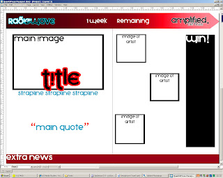
I created the draft of my front cover mainly in Photoshop, for its ability to manipulate objects on seperate layers, and also its drawing capabilities, which was really useful in creating aspects like the glow effect of the fonts and also drawing and editing shapes. I'm happy with the layout, but I might need to squash the lower elements down slightly to make the large main front cover photo more dominating. I also might need to get rid of the top information bar if I want the heads of the front cover models to obscure a little of the title.


My contents page was put together in Quark Express, a desktop publisher, though some of the elements were initially created in Photoshop due to Quark's inferior drawing and image manipulation abilities. Again, I am happy with the general layout and colour scheme of the page, but slightly dissatisfied with the abbreviated Radiowave logo, which is poorly clipped with Quark's image transparency settings. I might need more photographs other than the main image, as I have not yet decided how large I want the editor's note to be, so the amount of space I have for contents is sketchy so far.


Again, my double page spread is designed and put together in Quark Express. I'm hoping the layout will remain similar to this, though I might need more room for the information on each artist. I changed the colour scheme for this because the photos mainly follow a black, white, red and blue theme, and the normal orange and blue theme wouldn't have fitted. The article I plan to write for this bit will hopefully be about 3 finalist bands in a competition created by the magazine and information on some of the bands' members. I might also make the bottom news bar gradiented like the top.


Monday, 18 January 2010

Development: Shot List

Shot of/Shot type?
Location?
Props/costume etc?
Actors?
Technology required and organisation required?
Date/Time?


  • Group Shot (Long)
  • Studio
  • Costume – dark jeans, white/black tops, dark makeup and backcombed hair. Guitar/mic props.
  • Three models. Rivalry theme, feigning attack - Possible main feature photo
  • Book/share studio, digital camera and white screen backdrop. Arrange for all models to meet.
  • Afternoon
  • 20/1/10

  • Group Shot (Long) - Front Cover Shot
  • Studio
  • Same costume as above, no props
  • Three models. Rivalry theme. One centered - boy, others either side - girls.
  • Book/share studio, digital camera and white screen backdrop. Arrange for all models to meet.
  • 20/1/10

  • Single close-up shots - One of each artist
  • Studio
  • Same costumes
  • Same models, semi-comical expressions, looking down the page at one another - one shocked, one sideways glace, one thoughtful
  • Book/share studio, digital camera and white screen backdrop. Arrange for all models to meet.
  • 20/1/10

  • Single Long shot
  • Riverside/square
  • Casual/alt. clothing, guitar
  • One of the three initial models, casual pose, ignore camera, playing guitar possibly?
  • Organise meet, weather permitting, digital camera
  • Mid-morning, 9/1/10
    ALREADY COMPLETED


Development: Trial Photos


I went out with my camera last weekend to test out a few poses and shots with a friend who had also agreed to be a model for my final magazine. We went through a few poses which might be useful, and after taking them, I also tweaked the colours and lighting on Photoshop to achieve warmer/cooler tones, and look at techniques I may need to consider on my final photos. I like some of the photos enough to possibly include one or two of them as part of my final double page spread, and I plan to use my friend again for the front page.

Monday, 11 January 2010

Audience Research: Results

So after gathering images and creating a moodboard that represented the image of the magazine, I posted it up onto facebook, where I could find my target audience and collect opinions and critique in reaction to the initial ideas.


Accompanying the picture, I also asked:

-Would this appeal to you and why?

-Are the colour/font themes effective? (I'm thinking of using the blue/orange theme, but speculation would help!)

-Where would you expect to find this magazine?

-Aside from articles on the bands themselves, what else would you like to see?

-What price would you expect to pay for it?

The moodboard got a very positive reaction, the fact I incorporated things beyond a normal music magazine such as records and tapes, as well as fashion was well recieved. By striking this balance, I've managed to encourage a wider audience, as noted by one messager: "It appeals to me cos it has a mix of images, such as skinny jeans for the youth and LPs for the older generation. The font is good cos it isn't too childish but it isn't too formal either :)" Similarly, the colour scheme "works well" but I might have issues overlaying the brighter colours onto equally pale backgrounds, something I will have to pay attention to if I want my text to be legible. Every messager, when asked what else they would like to see, suggested both band interviews and, interestingly, fashion, a topic not often covered by music magazines, and a possible niche market for me, as I think that fashion and music are indeed linked, and this could open up possibilities for moneymaking though charging particular clothing stores to advertise in the magazine. Everyone expected to find this magazine at supermarkets, within the music section, but one messeger also suggested "indie clothing shops such as Urban Outfitters or Blue Banana" which would also be pretty useful, both targeting my audience and again exploiting fashion routes. On average, every person averaged on £2 paid on price, less than magazines such as Kerrang, but fitting the target audience, many of which would be teenagers with a lesser allowance/access to money.

Monday, 4 January 2010

Research - A detailed audience profile

Age Range: 16-25
The magazine is designed for people with both an interest in music generally and in success and careers within the music industry. At this age, there is a sudden change in the levels of disposable income and indeed freedom, with part-time jobs and student lifestyle making the audience more socially active, helpful when considering word of mouth would be one of the main forms of promotion. Beyond this age, jobs or a family lifestyle may lessen the interest. Also, the performance side of the music industry is today mostly dominated by younger artists which would in turn appeal to an audience of a similar age.

Psychographics: Strivers/Aspirers. Also for Belongers/Hedonists/Loyal
Being a magazine to promote unsigned artists, it has an aspirer slant, giving striving unsigned artists a chance of exposure and recognition in order to be able to further their musical careers. This in turn is able to provide encouragement for an aspiring audience who would then be able to contribute their own stories to the magazine, and would especially interest student artists at both college and university in deciding what steps they may take into the music industry. There is also an audience who simply wish to consume the bands after gaining an interest, and would need disposable income and be loyal to the band, with a want to spend money in the forms of gigs, merchandise and CDs, able to follow the band to obscure venues etc. Belongers would aid this by then spreading the word of a favoured band and helping it become popular.

Demographics: C1 – A

The audience would need to have a fair disposable income, for the unsigned artists are completely reliant on the sales from the audience, without monetary support from any labels. The audience would be generally strivers because of the magazine’s content and so would generally end up with higher positions within a job.